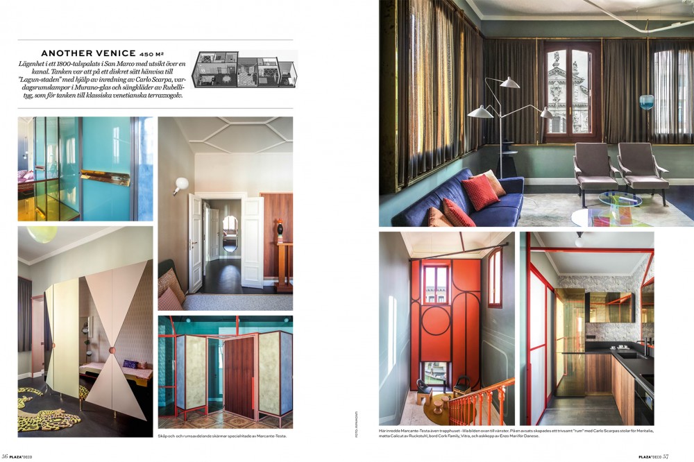
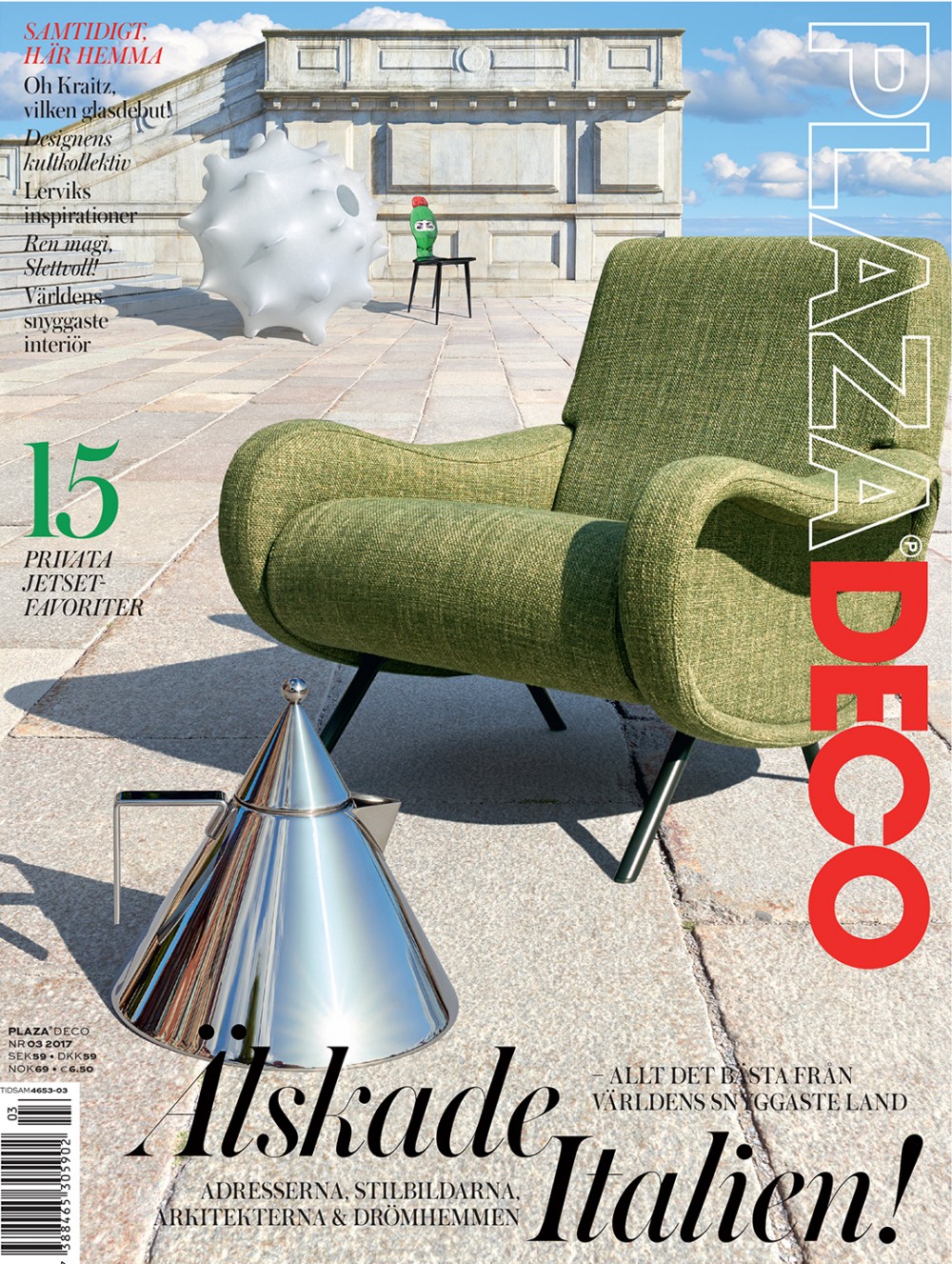
PLAZA DECO, nel numero speciale dedicato all’Italia, ha pubblicato “French Metal Rack”, “Another Venice”, “Le Temps Retrouvé”, “Metaphysical Remix” e “Grand Tour”.
Articolo di Ivan Carvalho
Foto di Karel Balas e Carola Ripamonti
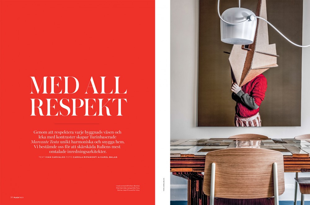
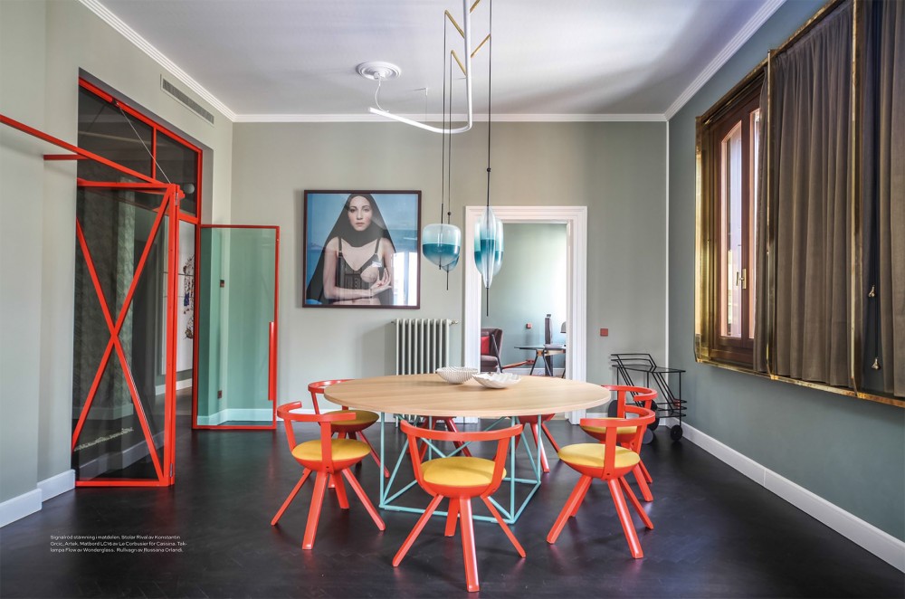
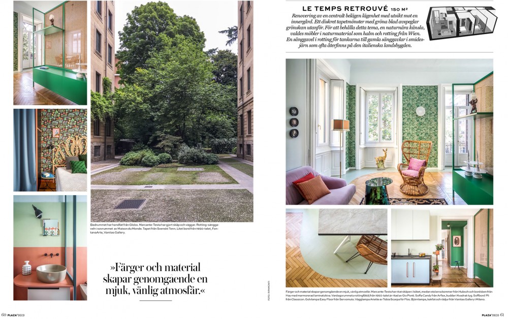
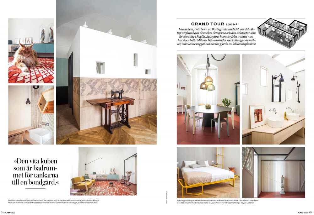
When the topic of Italian interior design is brought up, the conversation inevitably turns to Milan, where furniture brands, architects and designers interact on a daily basis and where trends in home decoration are often born. But the city’s one-time monopoly is slowly being eroded as creative talents from elsewhere in the Bel Paese are starting to raise their voice and put forth their ideas about how best to arrange interior spaces. Take the talented duo from Turin, Andrea Marcante and Adelaide Testa, for example.
In project after project, this torinese tandem works carefully with clients to assemble home environments that are respectful of their surroundings and exude good taste. Although their interior design studio started in 2014, their collaboration began a decade earlier when Testa joined UdA, a Turin-based architectural practice that was cofounded by Marcante in 1992. Over time, Marcante’s interest in interiors grew to the point where he decided to set up a design spin-off and dedicate his energies to crafting beautiful spaces for residential clients.
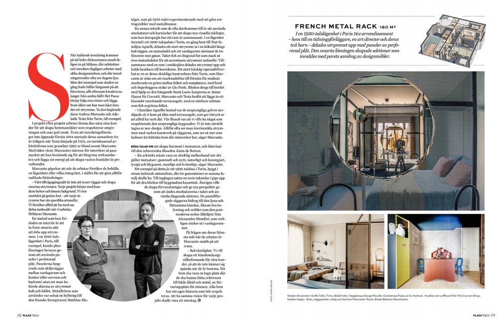
In their work, the architect Marcante admits that they try to maintain the integrity of an apartment or villa rather than trying to intervene radically in a space. “Our approach is not about breaking down walls and creating big volumes. Every project starts with the needs of the client and the background of the place. We are firm believers in genius loci, that each space has its own distinct nature. We always try to incorporate that when we work,” explains Marcante.
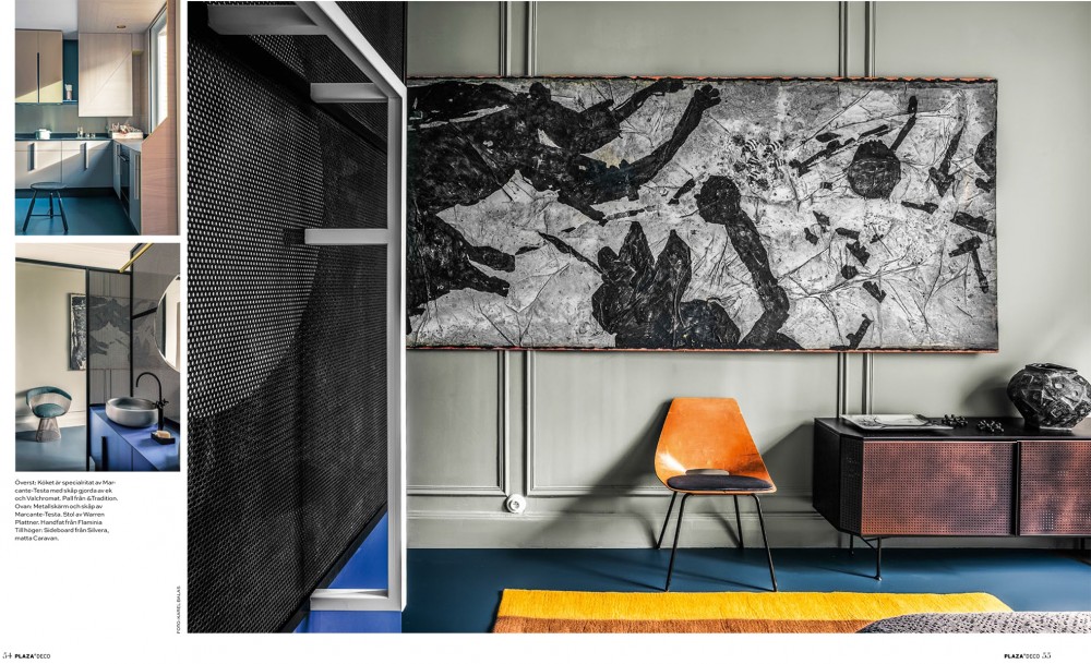
One way that the pair look to modify a home’s interior is by devising clever ways to divide space. For a 1930s Parisian flat, they respected the existing layout of the apartment by coming up with panels done in perforated sheet metal that work as transitional elements between a lounge and study (or an en-suite bathroom and bedroom) without the need to block off a space entirely. The use of metal tubes was also a tribute to French designer Mathiew Matégot, who in the 1930s experimented by creating rattan furniture with metal frames.
Another technique they often turn to is to rethink wall stuccos and cornices on ceilings to make new visual lines on the ceiling that reflect changes in a room’s composition. In the case of an apartment housed in a 19th-century Turin palazzo that once belonged to the Agnelli family of Fiat, a large space was divide into a kitchen unit along the back wall, a dining area and a living room next to a trio of windows looking out onto the street. The ceiling includes a diagonal cornice that juts out over the dining room to echo the positioning of furnishings below. This is paired with a wrought iron frame that looks to again subdivide the space and lead a visitor to the corridor. There is also a large wooden cabinet (custom made by one of their skilled Turin-based artisans that Marcante is eager to promote as a competitive advantage for his studio) to serve as a buffer between the cooking area and the dining room, which features a table accessorized with Gio Ponti’s Superleggera chairs. The eye is drawn to the table by Saint Louis suspended lamps created by Jaime Hayon for Ceccotti, while on the floor, Marcante and Testa decided to use classic Venetian terrazzo flooring, with a darker section in black used to demarcate where the kitchen begins.
“In the case of the former Agnelli residence, the original floors were stripped bare so we thought of adding this seminato flooring which gives the impression that it has always been there. Our philosophy was that we wanted something that respects the building in which the flat resides. We aren’t fans of neo-decoration. Too often you see spaces that are overdesigned, with beautiful artwork on the walls, that look more like sets than actual homes where people reside,” adds Marcante.
The two often speak of creating harmony out of opposites, citing the work of Swiss philosopher Alain de Botton. “Architects have to skillfully mediate between any number of opposites when it comes to an interior project: the old and the new, the natural and the man-made, the luxurious and the modest, the masculine and the feminine,” says Marcante.
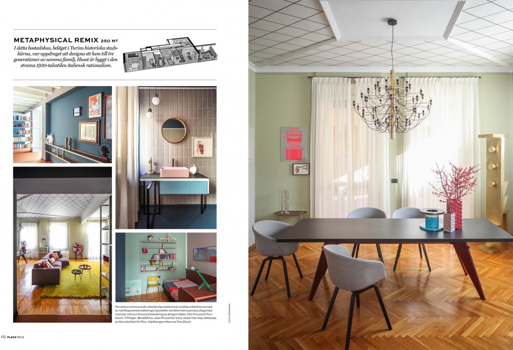
One such case was a 1930s home in Turin housed in a building done in the austere rationalist style that needed to house three generations of the same family. For the entrance they came up with a series of plaster trusses to evoke the coffered portico of the building. Again, they looked to create distortions in perspective by altering the stucco work on the ceiling and employed a diagonal pattern motif. They also turned to pastel colors to lighten the mood both on the walls and in terms of the furnishings they selected be it lighting or the postmodern chair-table by Alessandro Mendini that stands out in the living room.
When asked what their main goal is when working with clients, Marcante is quick to respond. “Comfort. We want to create an emotional well-being for residents so they don’t feel uptight when they occupy the space. A home should be where they feel reassured and where they should find references to both the past and present, it’s a repository of memories. Each residence has its own history and should be respected. Trying to impose the same design vision for each project would be a mistake.”


