” A sweeping terrazzo floor hints at 1950s modernism, pastel colours on the walls evoke the sprit of the 1980s,
and the graphic metal framework that snakes through the entire apartment has a decidedly futuristic feel.
This newly renovated Turin home […] represents the perfect balance of past, present and future design. […]”
words by Ali Morris
photos by Helenio Barbetta/Living Inside
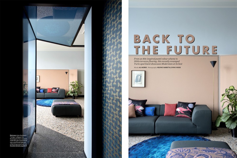
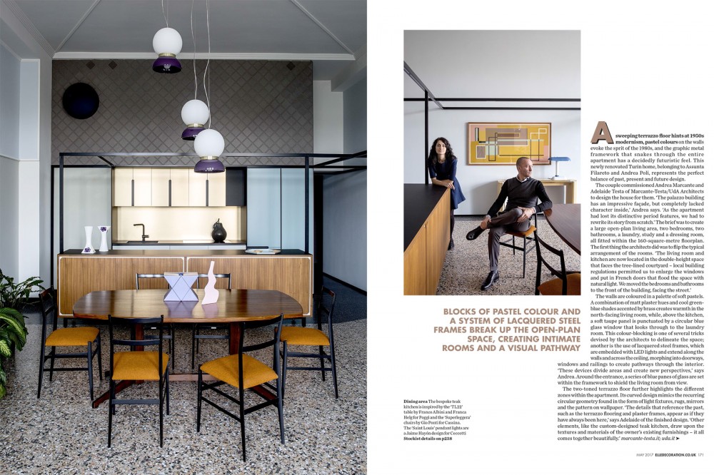
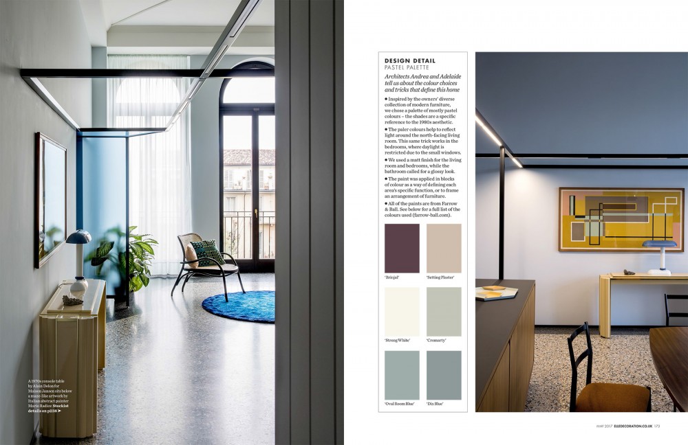
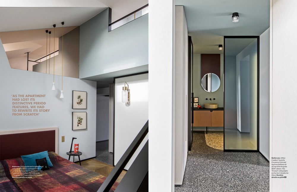
A sweeping terrazzo floor hints at 1950s modernism, pastel colours on the walls evoke the sprit of the 1980s, and the graphic metal framework that snakes through the entire apartment has a decidedly futuristic feel. This newly renovated Turin home, belonging to Assunta Filareto and Andrea Poli, represents the perfect balance of past, present and future design. The couple commissioned Andrea Marcante and Adelaide Testa of Marcante-Testa/UdA Architects to design the house for them. ‘The palazzo building has an impressive façade, but completely lacked character inside,’ Andrea says. ‘As the apartment had lost its distinctive period features, we had to rewrite its story from scratch.’ The brief was to create a large open-plan living area, two bedrooms, two bathrooms, a laundry, study and a dressing room, all fitted within the 160-square-metre floorplan. The first thing the architects did was to flip the typical arrangement of the rooms. ‘The living room and kitchen are now located in the double-height space that faces the tree-lined courtyard – local building regulations permitted us to enlarge the windows and put in French doors that flood the space with natural light. We moved the bedrooms and bathrooms to the front of the building, facing the street.’
The walls are coloured in a palette of soft pastels. A combination of matt plaster hues and cool greenblue shades accented by brass creates warmth in the north-facing living room, while, above the kitchen, a soft taupe panel is punctuated by a circular blue glass window that looks through to the laundry room. This colour-blocking is one of several tricks devised by the architects to delineate the space; another is the use of lacquered steel frames, which are embedded with LED lights and extend along the walls and across the ceiling, morphing into doorways, windows and railings to create pathways through the interior.
‘These devices divide areas and create new perspectives,’ says Andrea. Around the entrance, a series of blue panes of glass are set within the framework to shield the living room from view.
The two-toned terrazzo floor further highlights the different zones within the apartment. Its curved design mimics the recurring circular geometry found in the form of light fixtures, rugs, mirrors
and the pattern on wallpaper. ‘The details that reference the past, such as the terrazzo flooring and plaster frames, appear as if they have always been here,’ says Adelaide of the finished design. ‘Other elements, like the custom-designed teak kitchen, draw upon the textures and materials of the owner’s existing furnishings – it all comes together beautifully.’
