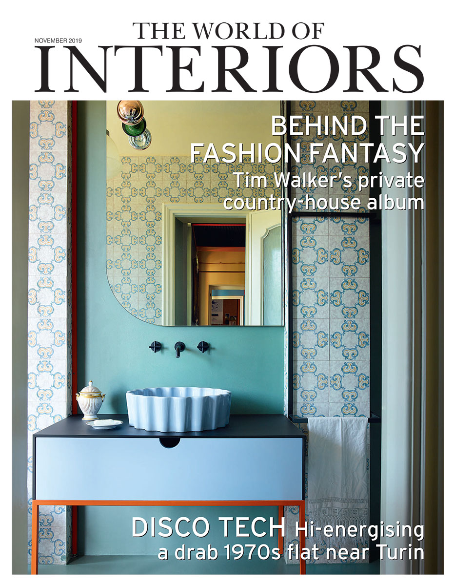
The World of Interiors chose our project in Cavallermaggiore as a cover story for its November 2019 issue:
“BLOOD ORANGE”
Text: Lee Marshall – Photography: Simon Upton
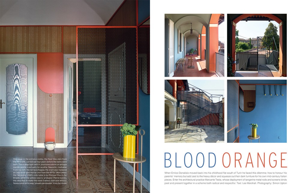
When Enrico Donalisio moved back into his childhood flat south of Turin he faced this dilemma: how to honour his parents’ memory but add zest to the heavy décor and squeeze out their dark furniture for his own mid-century Italian pieces. Enter the architectural practice Marcante Testa, whose deployment of tangerine metal rods and screens binds past and present together in a scheme both radical and respectful.
IN THE SUMMER of 2014, Andrea Marcante was asked to participate in a video project for a Turin architecture festival. The idea was to create a dialogue between architects and home owners, and so Marcante was sent off to the near by town of Cavallermaggiore to comment on a flat belonging to a pair of twin brothers.
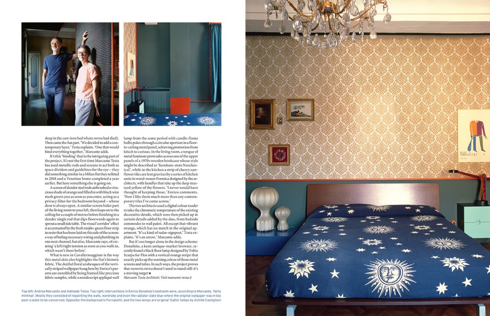
One of the siblings, 42-year-old Enrico Donalisio, was planning to move back into what had been his childhood home. Dating from around 1860 and renovated by his parents in the early 1970s, the apartment held mostly good memories for Enrico, and he was keen, he says, ‘to keep much of it just as it was’. But at the same time, he adds, ‘some of the furniture and décor was a bit heavy’ – so he wanted to find a way of freshening things up without losing what Italians refer to as the memoria storica of the place.
What started as a video project soon turned into a professional blind date. Donalisio was so impressed by Marcante’s sympathetic response to his home – so distant from the blank canvas that many architect/designers demand – that he asked him there and then if he and his studio partner, Adelaide Testa, would be interested in taking on the renovation (together they head up the practice of Marcante-Testa, founded in 2014). They were. In fact, they leapt at the chance. As Testa explains: ‘We’d been looking for a project like this for a while, one that had nothing to do with restoration in the historic sense of the word, but everything to do with the lives and memories of the people who had inhabited the space.’ A recent commission to freshen up the staff canteen of a Turin jail, with a view to making it a prisoner run public restaurant in the evening, had deepened the pair’s ongoing interest in architecture’s emotional and psychic impact.
Cavallermaggiore is a quiet, historic town in the fertile upper Po river basin. The main employer is a cheese factory. A brief moment of fame came in 1863, when Italy’s new king, Vittorio Emanuele II, gave it the status of city – before it reverted to being a small town with a big name. Enrico and his brother, Paolo, were born here in April 1977, in the apartment their parents had moved into as newlyweds four years earlier. The house belonged to the twins’ grandparents, who lived downstairs; it had been built just after the midpoint of the 19th century by an uncle of Ascanio Sobrero, the inventor of nitroglycerine.
Marcante and Testa began, with Enrico’s help,by taking stock of what was already there. The answer was, Enrico admits, ‘stuff from all different eras’. Some had been inherited from his grand parents, some dated from his parents’ 1973 redecoration, some was purely sentimental – like the ‘Wanted Dead or Alive’ poster featuring the young twins that still hangs on the kitchen wall.
All together, they made a list of what should remain, basing the choices not only on vintage appeal but also on state of conservation (some of the wallpaper had seen better days) and less tangible factors (Enrico was reluctant, for example, to sleep in the cast-iron bed where nonna had died).
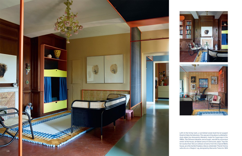
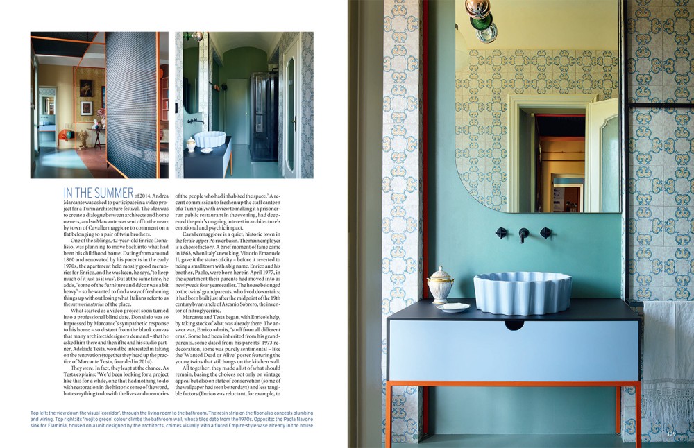
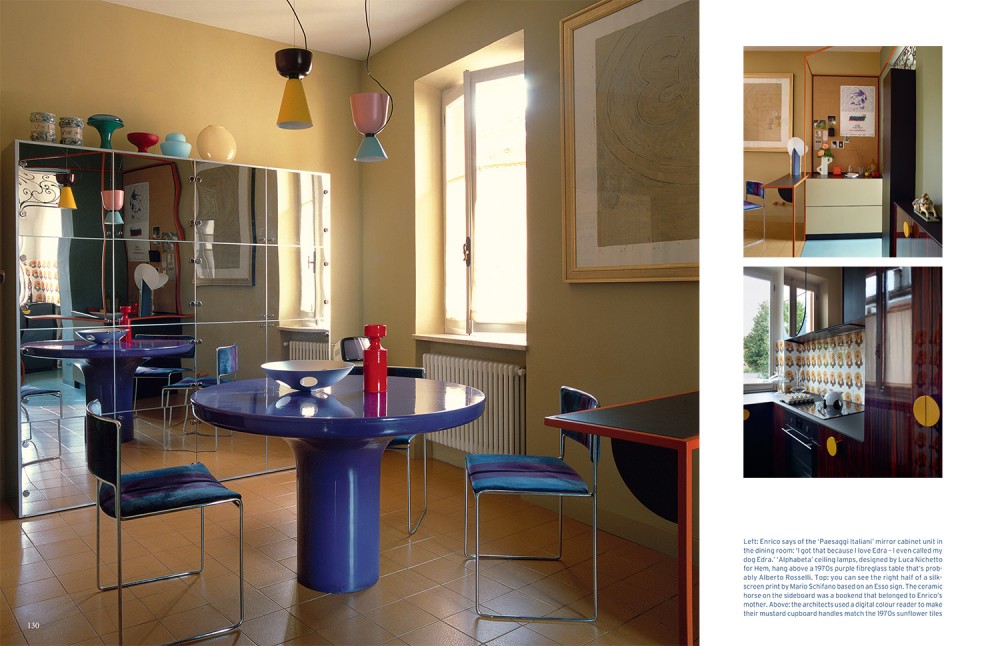
Then came the fun part. ‘We decided to add a contemporary layer,’ Testa explains. ‘One that would bind everything together,’ Marcante adds. It’s this ‘binding’ that is the intriguing part ofthe project. It’s not the first time Marcante Testa has used metallic rods and screens to act both as space dividers and guidelines for the eye – they did something similar in a Milan flat they refitted in 2018 and a Venetian home completed a year earlier. But here something else is going on. A screen of slender steel rods airbrushed a vivacious shade of orange and filled in with black wire mesh greets you as soon as you enter, acting as a privacy filter for the bedroom beyond – whose door is always open. A similar screen hides part of the living room to your left, then leaps on to the ceiling for a couple of metres before finishing in a slender single rod that dips f loorwards again to sprout a small side table. The visual ‘corridor’ effect is accentuated by the fresh mojito-green floor strip in resin that has been laid on this side of the screen: a way of hiding necessary wiring and plumbing in one neat channel, but also, Marcante says, of creating ‘a left/right tension as soon as you walk in, which wasn’t there before’. What is new in Cavallermaggiore is the way this metal skin also highlights the f lat’s historic fabric. The dutiful f loral arabesques of the vertically striped wallpaper hung here by Enrico’s parents are ennobled by being framed like precious fabric samples, while a nondescript appliqué wall lamp from the same period with candle-flame bulbs pokes through a circular aperture in a floor-to-ceiling metal panel, achieving promotion from kitsch to curious. In the living room, a tongue of metal laminate protrudes across one of the upper panels of a 1970s wooden bookcase whose style might be described as ‘furniture-store Neo classical’, while in the kitchen a strip of cheery sunflower tiles are lent gravitas by a series of kitchen units in wood-veneer Formica designed by the architects, with handles that take up the deep mustard yellow of the f lowers. ‘I never would have thought of keeping those,’ Enrico comments. ‘Now I like them much more than any contemporary tiles I’ve come across.’
The two architects used a digital colour reader to take the chromatic temperature of the existing decorative details, which were then picked up in certain details added by the duo, from bedside commodes to wall paint. All except that vibrant orange, which has no match in the original apartment. ‘It’s a kind of radar-signpost,’ Testa explains. ‘It’s an arrow,’ Marcante adds. But it’s no longer alone in the design scheme: Donalisio, a keen antique-market browser, recently found a black floor lamp designed by Tobia Scarpa for Flos with a vertical orange stripe that exactly picks up the warning colour of those metal screens and tubes. In such ways, the project proves that memoria storica doesn’t need to stand still: it’s a moving target.

