“In a top-to-bottom reimagining of a 1960s-era Milanese apartment, one of Italy’s most innovative architecture firms conjures the spirit of that vaunted age.”
by Kurt Soller
photos by François Halard


LEMON, STRAWBERRY and pistachio — these are the chalky colors that follow you through Milan, whether you’re staring out over the faded facades of the city’s villas from the seventh-floor gallery of the Fondazione Prada tower, the fashion brand’s four-year-old art museum, or sipping a macchiato down below at Bar Luce, the Wes Anderson-designed cafe. Inspired by midcentury Italian neorealist films (particularly Luchino Visconti’s 1960 “Rocco and His Brothers”), the American director chose design details — Formica tables, glass-front cabinets and speckled terrazzo floors — in those same confectionary hues.
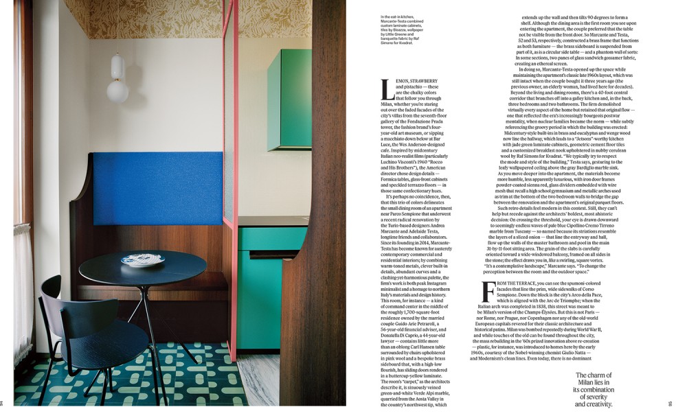
It’s perhaps no coincidence, then, that this trio of colors delineates the small dining room of an apartment near Parco Sempione that underwent a recent radical renovation by the Turin-based designers Andrea Marcante and Adelaide Testa, longtime friends and collaborators. Since its founding in 2014, Marcante-Testa has become known for austerely contemporary commercial and residential interiors; by combining warm-toned metals, clever built-in details, abundant curves and a clashing-yet-harmonious palette, the firm’s work is both peak Instagram minimalist and a homage to northern Italy’s materials and design history. This room, for instance — a kind of command center in the middle of the roughly 1,700-square-foot residence owned by the married couple Guido Arie Petraroli, a 56-year-old financial adviser, and Donatella Di Caprio, a 44-year-old lawyer — contains little more than an oblong Carl Hansen table surrounded by chairs upholstered in pink wool and a bespoke brass sideboard that, with a high-low flourish, has sliding doors rendered in a buttercup-yellow laminate. The room’s “carpet,” as the architects describe it, is sinuously veined green-and-white Verde Alpi marble, quarried from the Aosta Valley in the country’s northwest tip, which extends up the wall and then tilts 90 degrees to form a shelf. Although the dining area is the first room you see upon entering the apartment, the couple preferred that the table not be visible from the front door. So Marcante and Testa, 52 and 53, respectively, constructed a brass frame that functions as both furniture — the brass sideboard is suspended from part of it, as is a circular side table — and a phantom wall of sorts: In some sections, two panes of glass sandwich gossamer fabric, creating an ethereal screen.
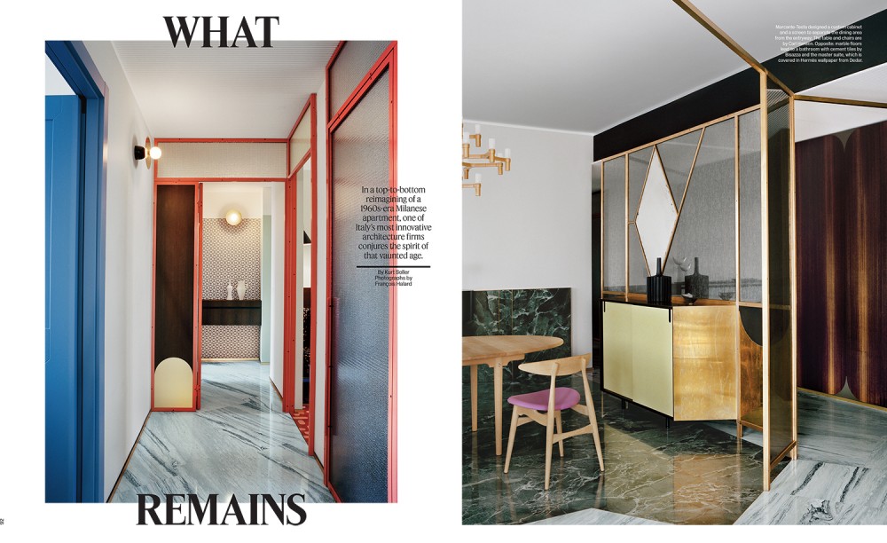
In doing so, Marcante-Testa opened up the space while maintaining the apartment’s classic late 1960s layout, which was still intact when the couple bought it three years ago (the previous owner, an elderly woman, had lived here for decades). Beyond the living and dining rooms, there’s a 40-foot central corridor that branches off into a galley kitchen and, in the back, three bedrooms and two bathrooms. The firm demolished virtually every aspect of the home but retained that original flow — one that reflected the era’s increasingly bourgeois postwar mentality, when nuclear families became the norm — while subtly referencing the groovy period in which the building was erected: Midcentury-style built-ins in brass and eucalyptus and wenge wood now line the hallway, which leads to a “Jetsons”-worthy kitchen with jade green laminate cabinets, geometric cement floor tiles and a customized breakfast nook upholstered in nubby cerulean wool by Raf Simons for Kvadrat. “We typically try to respect the mode and style of the building,” Testa says, gesturing to the leafy wallpapered ceiling above the gray Bardiglio marble sink. As you move deeper into the apartment, the materials become more humble, less apparently luxurious, with iron door frames powder-coated sienna red, glass dividers embedded with wire mesh that recall a high school gymnasium and metallic arches used as trim at the bottom of the two bedroom walls to bridge the gap between the renovation and the apartment’s original parquet floors.
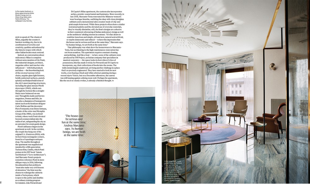
Such retro details feel modern in this context. Still, they can’t help but recede against the architects’ boldest, most ahistoric decision: On crossing the threshold, your eye is drawn downward to seemingly endless waves of pale blue Cipollino Cremo Tirreno marble from Tuscany — so named because its striations resemble the layers of a sliced onion — that line the entryway and hall, flow up the walls of the master bathroom and pool in the main 31-by-11-foot sitting area. The grain of the slabs is carefully oriented toward a wide-windowed balcony, framed on all sides in the stone; the effect draws you in, like a swirling, square vortex. “It’s a contemplative landscape,” Marcante says. “To change the perception between the room and the outdoor space.”
FROM THE TERRACE, you can see the spumoni-colored facades that line the prim, wide sidewalks of Corso Sempione. Down the block is the city’s Arco della Pace, which is aligned with the Arc de Triomphe; when the Italian arch was completed in 1838, this street was meant to be Milan’s version of the Champs-Élysées. But this is not Paris — nor Rome, nor Prague, nor Copenhagen nor any of the old-world European capitals revered for their classic architecture and historical patina. Milan was bombed repeatedly during World War II, and while touches of the old can be found throughout the city, the mass rebuilding in the ’60s prized innovation above re-creation — plastic, for instance, was introduced to homes here by the early 1960s, courtesy of the Nobel-winning chemist Giulio Natta — and Modernism’s clean lines. Even today, there is no dominant style to speak of: The charm of Milan, arguably the country’s hardest-working city, lies in its combination of severity and creativity, qualities unburdened by the historic tropes with which other Italian locales must contend.
Indeed, no conversation about midcentury Milan is complete without some mention of Gio Ponti, the industrial designer, architect, magazine editor and teacher who influenced — with both products and ideas — the freewheeling look of the era (curvaceous velvet chairs, angular glass light fixtures, boldly patterned surfaces, pastels aplenty) and helped build some of the city’s most inspiring structures, including the glass-mosaic Pirelli skyscraper (1960), which cuts through the horizon like a straight-blade razor balanced on one end. Through his studio and his two magazines, Domus and Stile, he was also a champion of homegrown talent (such as the furniture designer Carlo Mollino and the decorator Piero Fornasetti; even Ettore Sottsass, a leader of the color-mad Memphis Group of the 1980s, was in thrall to him), whose work Ponti elevated beyond commercialism into the realm of art, safeguarding his city as an epicenter for avant-garde design.
Ponti’s influence lingers in the apartment as well. In the corridor, the couple has hung one of his original F.A. 33 mirrors (1933), with its bent-brass rectangular corners, found in a Copenhagen antiques shop. The marble throughout the apartment was supplied and installed by a fifth-generation Turinese firm, Catella, which Ponti praises in his 1957 book “Amate l’architettura” (“Love Architecture”). And Marcante-Testa’s projects sometime reference Ponti in more oblique ways; in 2016, following his admonition that architects “must also make very civil houses of detention,” the firm won the chance to redesign the cafeteria inside a Turin prison, which is open to the public and doubles as a culinary training program for inmates. Like Petraroli and Di Caprio’s Milan apartment, the canteen also incorporates arches, powder-coated metal and laminates. More recently, in late 2018, Marcante-Testa renovated the Milanese women’s wear boutique Imarika, outfitting the shop with clear plexiglass cabinets and a monumental sales counter made of clay and pink maple briarwood. While these projects often share a similar restrained palette and the elevated use of everyday materials, they’re visually dissimilar; still, the firm’s designs are cohesive in their consistent referencing of Italian midcentury design as well as the architects’ abiding interest in contrast. “It’s that desire to combine luxurious and simple, old and new, natural and artificial, or maybe democratic and refined — to have this impression that the house can be serious and fun at the same time,” Marcante says. “As human beings, we are both at the same time.”
That philosophy was what drew the homeowners to Marcante-Testa, but acclimating to the high-maintenance renovation has not been seamless. The apartment requires constant cleaning and polishing. And like a boat — in fact, some of the cabinets were produced by OM Project, an Italian company that specializes in nautical carpentry — the space looks its best when it’s free of possessions; this has made it tricky for Petraroli and Di Caprio to incorporate, say, their collections of books into the rooms. The walls remain largely unadorned, art being another challenge in a place that’s so precisely engineered. They have started to look for new works, even buying a black-and-white abstract painting during a recent trip to Venice, but on a December afternoon, the canvas was still leaning against a dining room wall. Perhaps the apartment, like the era it so clearly evokes, is already a finished thought.


